Conventions & connection
Scan.me
An offline-first event platform that combines wayfinding, gamified quests, and sponsor analytics to redistribute foot traffic across large convention venues.
Overview
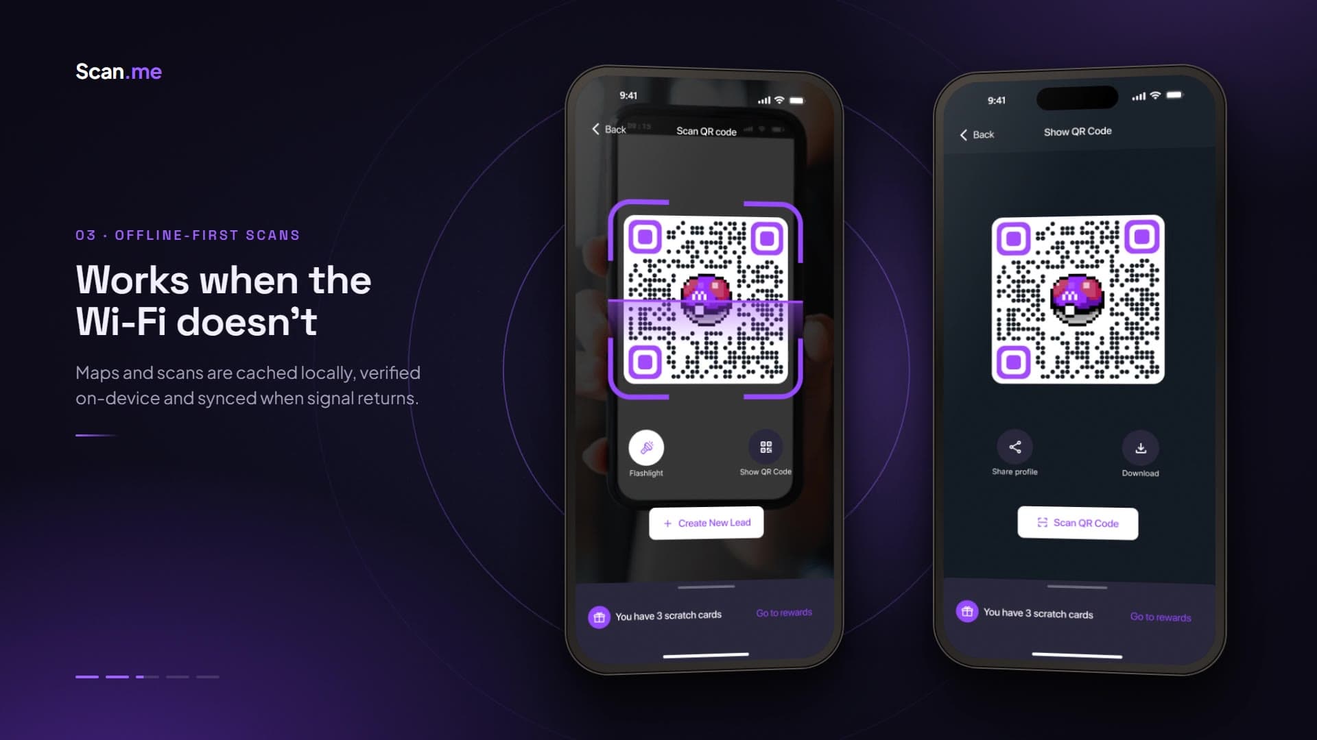
Scan.me is an offline-first event platform that combines interactive wayfinding, gamified quests, and sponsor analytics to redistribute foot traffic across large convention venues. I led product design and design engineering across a 10-week 0-to-1 cycle covering architecture, wayfinding, the design system, and prototyping, for a native iOS and Android app plus an admin analytics console serving attendees, organizers, and sponsors.
Impact
Conventions concentrate traffic near entrances and leave perimeter sponsors under-served. Scan.me turns navigation into guided exploration that keeps working when the venue's connectivity fails: +42% perimeter and back-hall footfall through dynamic quests, 88% offline retention during cellular and Wi-Fi blackouts, and a 3.5× sponsor impression rate through verified scans and dwell-time signals.
- Perimeter and back-hall footfall
- +42%
- Offline retention during connectivity blackouts
- 88%
- Sponsor impression rate
- 3.5×
The problem
Static maps are hard to use in large, multi-level venues, and attendees cluster around familiar entrance booths. Cloud-dependent apps fail when thousands of visitors compete for connectivity, and sponsors lack reliable movement and intent data.
Research & direction
Research with 14 convention attendees and 4 expo management teams, plus patterns from Google Pay, rep cards, maps, and CRM tools, showed that attendees wanted discovery but were overwhelmed by 200+ booths, that venue Wi-Fi couldn't be treated as infrastructure, and that QR-only gamification invited badge farming and code sharing. The pivot was an offline-first spatial platform: local map bundles, quest routing, and BLE and geofence proximity verification.
Design decisions
Dynamic quest routing groups booths into themed quests and lets organizers adjust point multipliers to steer traffic toward under-visited zones. Maps, booth data, and scan workflows are cached locally; scans are cryptographically verified on-device and queued for sync when connectivity returns. Scanning a QR code reveals booth or contact information and starts lead creation, with notes preserving the context of each conversation.
Visual language
Space Grotesk headings pair with Plus Jakarta Sans on a dark-default interface. Purple and neon accents reference gaming, tying the visual language to the reward mechanics, while Material Design informed familiar controls. Camera controls and bottom-zone actions stay thumb-accessible, and every scan is confirmed with haptic, audio, and visual feedback.
Key screens
The walkthrough covers an attendee's and an exhibitor's day: starting from the event dashboard, scanning to create a lead, sharing a rep card, earning rewards, finding booths, and managing leads afterward.
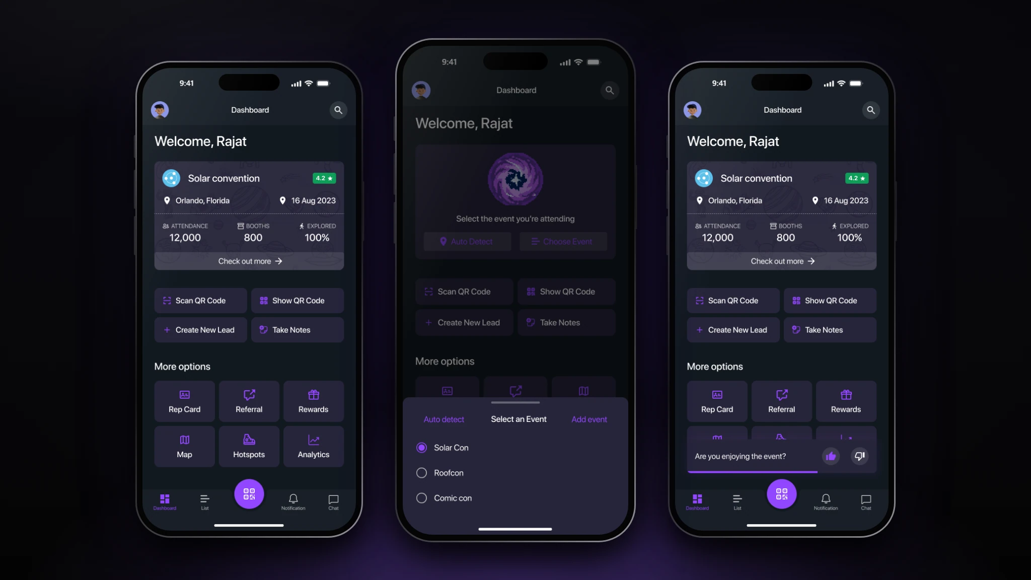
One home for everything an attendee or exhibitor does at an event.
- The screen
- The dashboard opens on the current event card with location, date, attendance, booth count, and how much of the venue the user has explored. Four primary actions (Scan QR Code, Show QR Code, Create New Lead, Take Notes) sit beneath it, with Rep Card, Referral, Rewards, Map, Hotspots, and Analytics as secondary options. A bottom sheet auto-detects or selects the event, and a small survey asks whether the user is enjoying it.
- The problem
- Conventions are overwhelming: hundreds of booths and every task in a different place. People needed one starting point that puts frequent actions first.
- Design decisions
- The screen is organized by frequency: four everyday actions get large tiles while less-used tools sit in a compact grid. A raised central QR button keeps scanning one thumb-tap away from anywhere. The purple-on-dark palette echoes gaming interfaces, which supports the reward mechanics elsewhere. The event picker is a bottom sheet so the dashboard stays visible behind it, and the survey is a toast rather than a blocking modal.
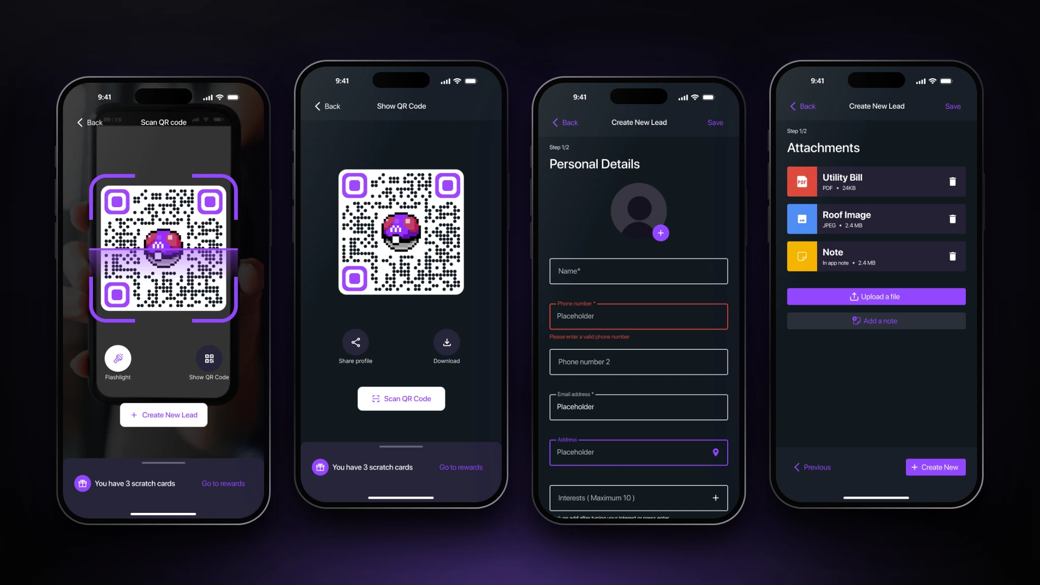
From a QR scan to a saved lead in a couple of taps.
- The screen
- The scanner frames a QR code with a lit reticle, a torch control, and a shortcut to show your own code, with a strip reminding users of unclaimed scratch cards. Show QR Code presents the user's code with share and download. Create New Lead is a two-step form (personal details with interest tags, then attachments and notes) that starts from the information in the scanned code.
- The problem
- Exhibitors lose leads because capturing one means typing contact details in a noisy hall, and attendees have no easy way to share who they are.
- Design decisions
- Scanning is the entry point, so camera controls sit in the thumb zone and feedback is immediate. Information travels inside the QR code, which removes most typing. The form is split into short steps with visible progress and inline validation, interests are removable tags for fast capture, and a persistent Save means a lead can be stored at any step.
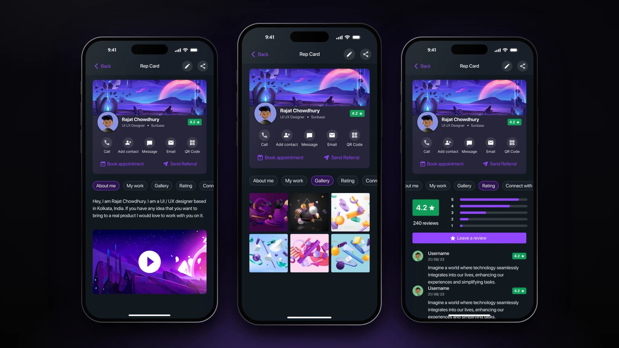
A shareable business card that carries the conversation forward.
- The screen
- The rep card is a profile that can be shown or shared by QR: cover, avatar, role, company, and rating, then one-tap Call, Add contact, Message, Email, and QR actions, plus Book appointment and Send Referral. Tabs beneath hold About me with video, My work, Gallery, Rating, and Connect with.
- The problem
- After a brief conversation at a booth, contact details are easy to lose and hard to follow up on. Reps needed a richer, always-current alternative to a paper card.
- Design decisions
- Actions sit directly under the identity block, so the likeliest next steps (call, message, save) are immediate. Depth is progressive: essentials on top, story, work, gallery, and ratings behind tabs, so both a quick scan and a deeper look work. A visible rating builds trust between people who just met, and the same profile card is reused for customers in the CRM, keeping one pattern across the app.
Rewards that keep attendees exploring and reps referring.
- The screen
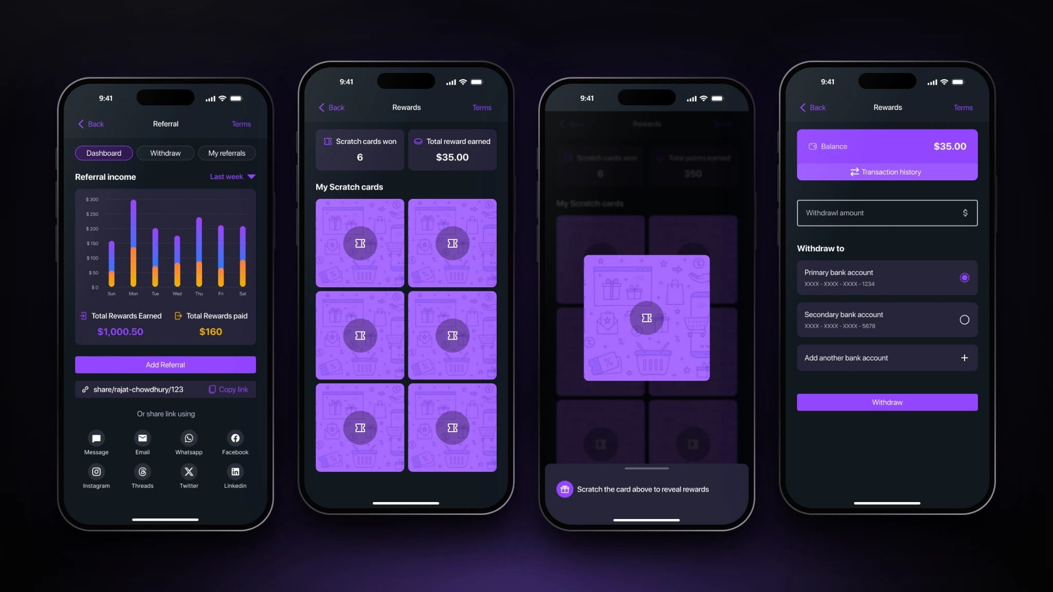
- The referral dashboard charts income by day and shows total rewards earned and paid, with a personal share link and one-tap sharing. The rewards screen holds a grid of scratch cards; opening one prompts the user to scratch, and the balance screen lets them withdraw to a chosen bank account.
- The problem
- A convention app only helps if people keep using it. Attendees drift toward familiar booths, so exhibitors and sponsors need reasons for visitors to explore and bring others along.
- Design decisions
- Rewards are earned through behavior the event wants (scanning, creating leads, referring), so incentive and goal align. Scratch cards add surprise and a tactile interaction suited to a gamified product, while the income chart and balance keep value transparent. The withdrawal flow is explicit about the destination account, with a primary preselected, because money features need clarity more than delight.
Finding the right booth in a crowded hall.
- The screen
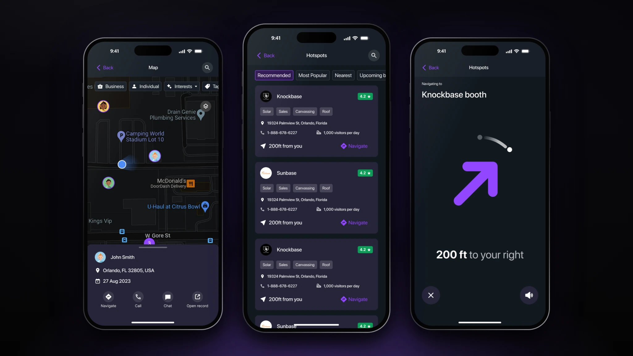
- The map shows the attendee, nearby contacts, and points of interest, with filters for business, individual, and interests, and a card for a selected contact with navigate, call, chat, and open-record actions. Hotspots ranks booths under Recommended, Most Popular, Nearest, and Upcoming, with distance, visitors per day, and tags. Navigate switches to a large directional arrow with remaining distance and a voice toggle.
- The problem
- Static maps are hard to use in large, multi-level venues, and attendees cluster around familiar entrance booths, leaving the perimeter under-served.
- Design decisions
- Wayfinding has three levels of commitment: a map for orientation, a ranked list for choosing, and a single-purpose arrow for walking. The last screen strips everything except direction, distance, and destination so it reads at a glance while moving. Recommended and Most Popular sorts turn crowd data into guidance, supporting the goal of redistributing traffic to under-visited areas.
Turning scans into an organized pipeline with clear business insight.
- The screen
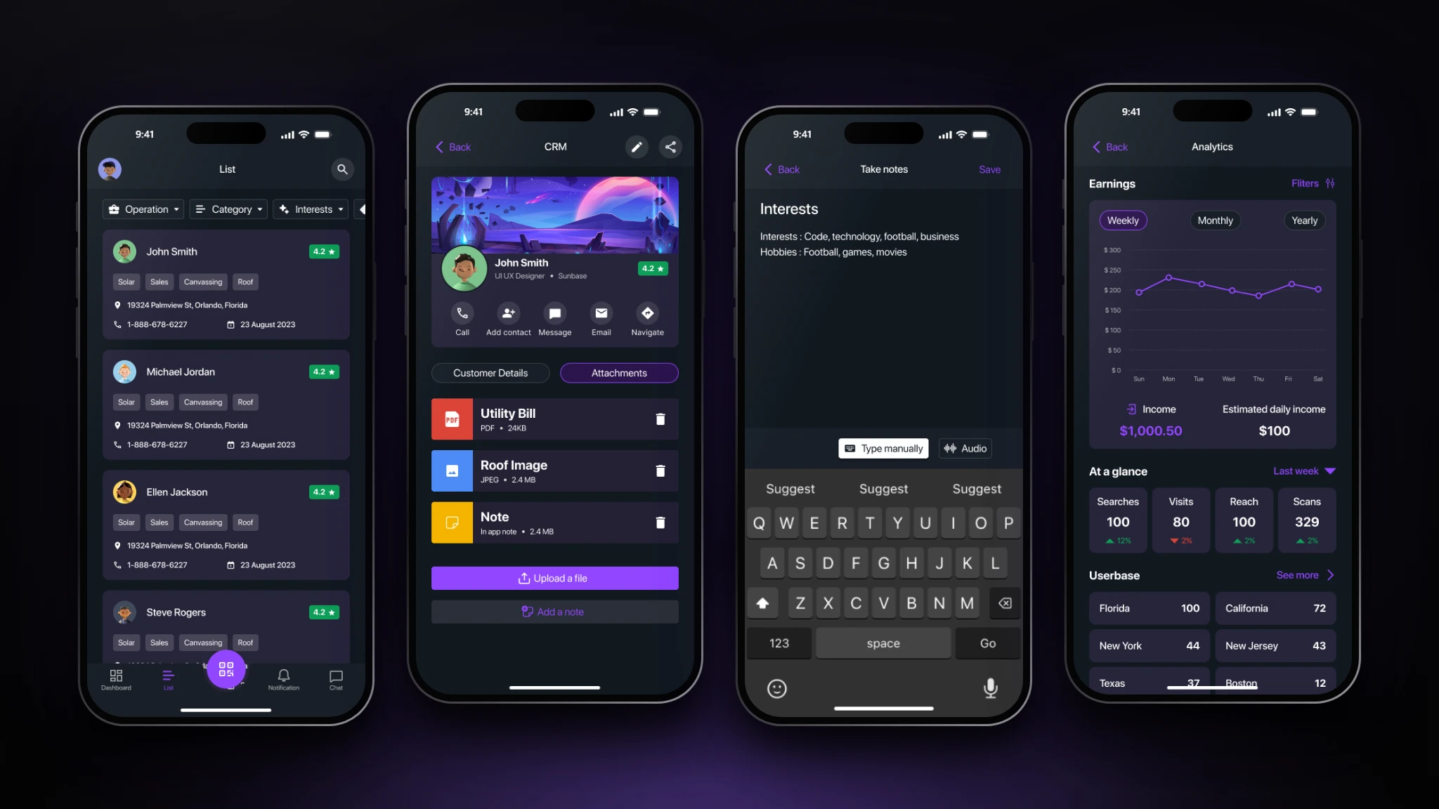
- The leads list shows each lead as a card with tags, address, phone, and date, filterable by operation, category, and interest. A lead opens to a profile card with customer details and attachments. Notes can be typed or dictated, and the analytics screen charts earnings weekly, monthly, or yearly with searches, visits, reach, scans, and a regional breakdown.
- The problem
- Leads gathered at events end up scattered across notes, photos, and spreadsheets, so context is lost before follow-up, and exhibitors lack a simple way to see whether the event paid off.
- Design decisions
- Leads are cards rather than rows, so the tags and location that matter for follow-up read without opening each record. Notes attach to the customer and can be dictated, which suits people who are standing and talking rather than typing. Analytics leads with earnings and follows with four compact metrics: a top-line answer first, detail on demand. List filters reuse the same operation, category, and interest controls as the rest of the app.
Edge cases & logic
Venue connectivity failure is handled with local map, booth, and scan bundles and queued synchronization. QR sharing is countered by BLE and geofence checks plus impossible-jump detection. The camera sleeps outside the scan flow to limit battery drain, real-time point multipliers redirect unbalanced crowd flow, and sponsor privacy relies on double opt-in lead transfer and minimized location retention.
Reflection & next steps
Physical-space UX depends on more than screen design: scan-point height, lighting, accessibility, and device constraints all affect task success. Next: AR indoor navigation with live directional cues, Flash-Quest bidding, and deeper post-event sponsor analytics. Scan.me turns convention navigation into a resilient spatial layer that helps attendees explore, gives organizers control over footfall, and gives sponsors consent-based engagement signals.