Sales performance & payroll
Next Phase Fiber
A responsive Next.js PWA built for mobile and desktop screens, giving door-to-door sales teams one trustworthy view of commissions, performance, and team standing, fed by an automated payroll pipeline.
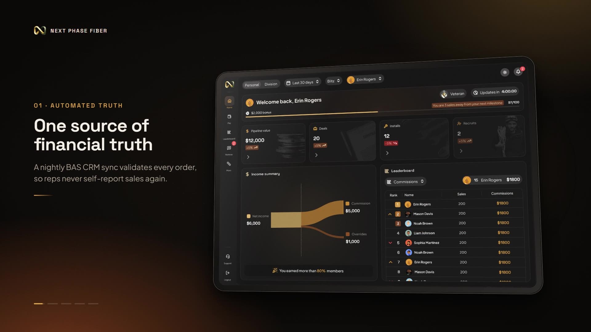
Overview
Next Phase Fiber is a responsive Next.js PWA designed and built with both mobile and desktop screens in mind. It gives door-to-door sales teams a single, trustworthy view of commissions, performance, and team standing. I led design end to end over a 45-day design and build sprint: product strategy, information architecture, responsive UX across mobile, tablet, and desktop, and the design system, for sales reps, team leaders, and operations admins.
Impact
Reps waited up to three weeks for reliable payout information, and leaders reconciled Spotio, BAS CRM, and Sequifi data by hand. Automating that changed three things: payroll visibility became real-time instead of uncertain, direct and override commissions became transparent enough to reduce disputes, and deep-linked referrals accelerated recruiting by 3×.
- Payroll visibility
- Before:
Up to 3 weeks. After: Real-time - Recruiting through deep-linked referrals
- 3× faster
The problem
The field team worked in a financial blind spot. Sales, CRM, and payroll data lived in disconnected systems, so reps couldn't see their own commissions or their downline's earnings, and leaders fell back on spreadsheets during live blitzes. The cost showed up as delays, errors, and churn.
Research & direction
Field research with reps and operations leaders reduced to three constraints. Manual logging bred fatigue and fraud risk, so anything reps had to type would decay. Outdoor use demanded five-second glanceability: large type, high contrast, minimal navigation. And leaders needed downline visibility without seeing private payouts. The pivotal decision was to stop asking reps to report sales at all. An automated midnight ingestion and validation pipeline from BAS made the PWA the financial source of truth.
Design decisions
Reps log orders in BAS CRM during the day. A midnight pipeline validates order status, and the PWA recalculates commissions, tiers, ranks, and overrides. That architecture shaped the design: where money is concerned the app is read-only, which removes both the incentive and the opportunity to game it. Access follows role. Reps see personal sales, tier progress, and referral invites; leaders see downline performance and override breakdowns; admins own audit logs, ISP plans, goals, and commission rules.
Visual language
The interface is built for sunlight and short attention. Space Grotesk carries KPI headers and Plus Jakarta Sans handles supporting text, on a Deep Slate (#0f172a) canvas. Metallic Gold (#f59e0b) is reserved for milestones and money, so color signals meaning rather than decoration. Large KPI tiles and sticky touch targets keep the core numbers readable at a glance.
Key screens
The walkthrough covers the surfaces reps and leaders use daily, the admin tools that keep payroll rules in the business's hands, and the states most designs skip: no connection, and no data yet.
Earnings, pipeline, and progress in a five-second glance.
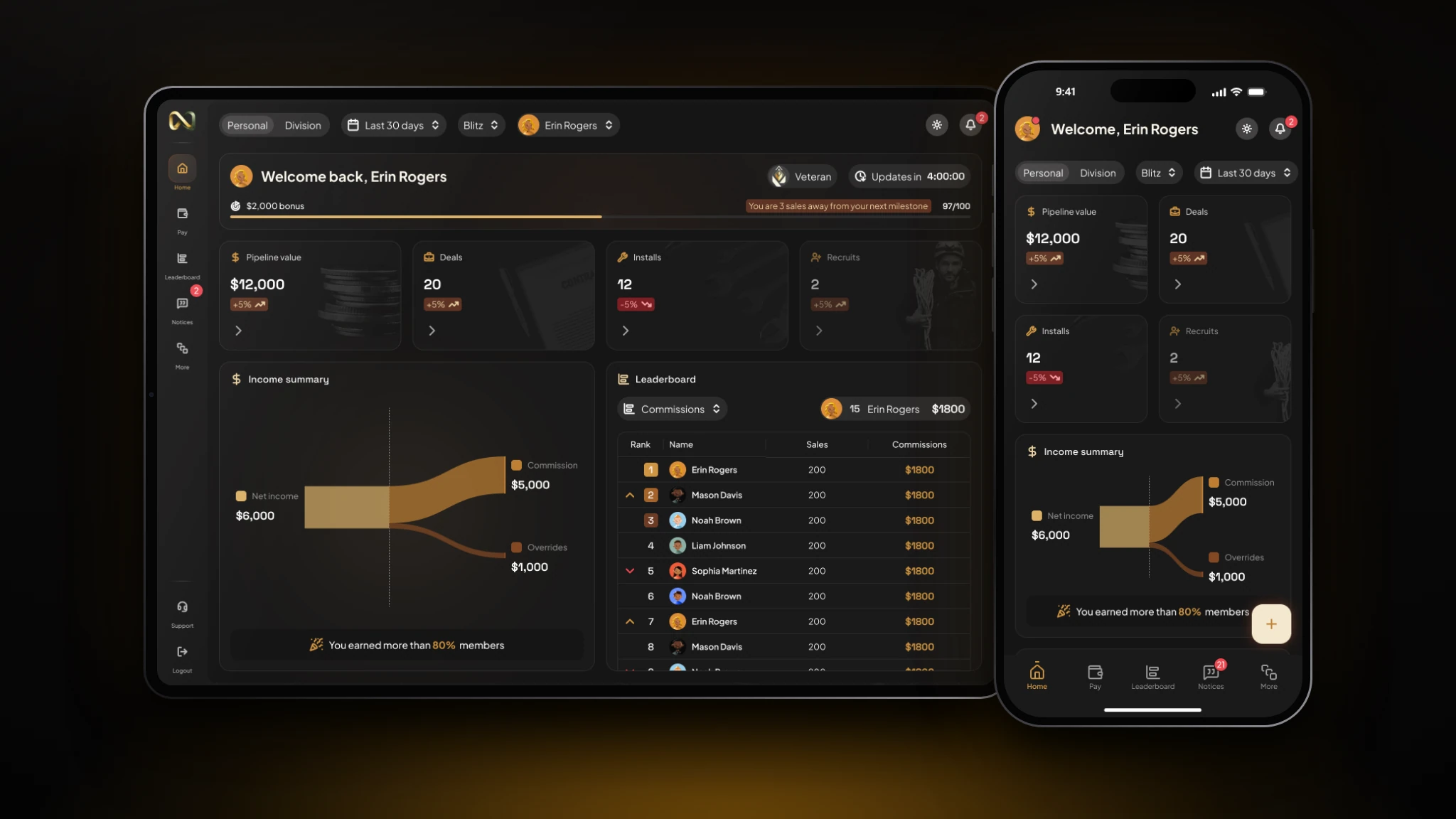
- The screen
- Home opens with the rep's tier and progress toward the next milestone, then large KPI tiles for pipeline value, deals, installs, and recruits, each with a trend. Below, an income summary splits net income into commissions and overrides beside a compact leaderboard. Personal and Division views, a date range, and a blitz filter scope the data, and a countdown shows when it next updates.
- The problem
- Reps couldn't see their own commissions or their downline's earnings, and confirmed payouts could take weeks to arrive.
- Design decisions
- Everything is tuned for outdoor glanceability: large tiles, high contrast, gold reserved for milestones and money. Separating direct commissions from overrides shows reps where earnings come from and how many sales remain to the next tier. The update countdown makes the nightly sync visible, which turns uncertainty into a clear expectation. On phone, the same content stacks into one column with bottom navigation.
Every order, its commission, and its status.
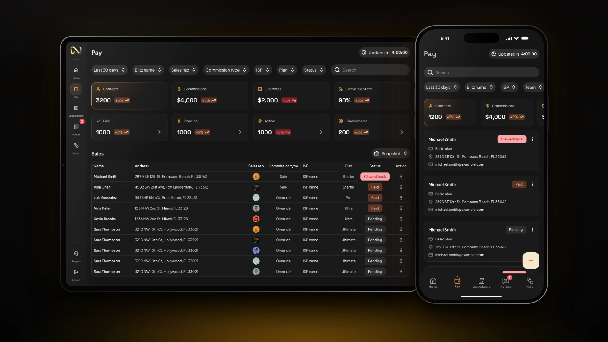
- The screen
- Pay opens with summary tiles for contacts, commissions, overrides, and conversion rate, plus counters for Paid, Pending, Active, and Clawback. The ledger below lists customer, address, rep, commission type, ISP, plan, and a status chip, with filters across all of them. On phone, each order becomes a card.
- The problem
- Reps and leaders couldn't tell which orders were paid, pending, or reversed, so disputes and follow-up questions were routine.
- Design decisions
- Status is the attribute people scan for, so it is the only element with a filled chip. Direct sales and overrides share one ledger, distinguished by commission type, so reconciliation stays in one place. Clawbacks are explicit line items rather than silent adjustments, which keeps the history auditable. Filters stay visible because leaders lean on them constantly during live blitzes.
Competition that refreshes on the same clock as payroll.
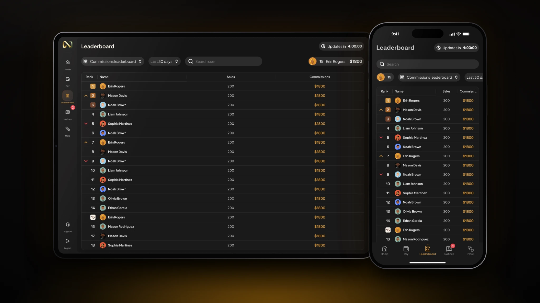
- The screen
- The leaderboard ranks reps by commissions for the selected period, with rank-change arrows, a search field, the next-update countdown, and the current user pinned in the header. On phone, the table compresses to rank, name, sales, and commission.
- The problem
- Motivation in the field ran on informal updates and spreadsheets, so leaders had no reliable way to show live standings during a blitz.
- Design decisions
- Only the top three get distinct badges, so leaders draw attention without cluttering the list. Movement arrows show momentum, which motivates more than a static rank. The user's own row is pinned so they never scroll to find themselves. Rankings refresh with commissions, so the leaderboard and payroll never disagree.
Payroll rules that admins can change without engineering.
- The screen
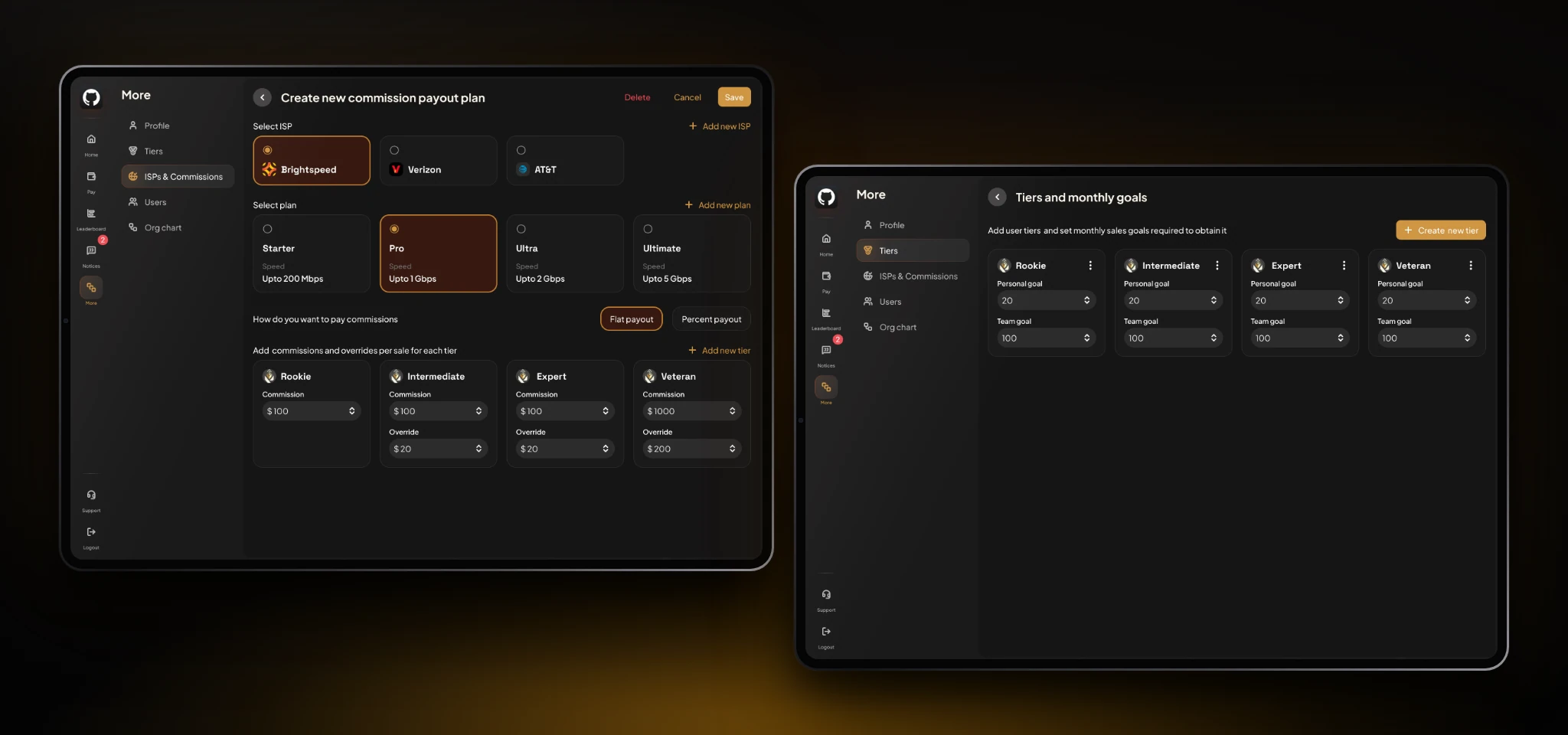
- Admins build a payout plan by choosing an ISP (Brightspeed, Verizon, AT&T), then a plan (Starter to Ultimate), then flat or percentage payout, then commission and override values for each tier from Rookie to Veteran. A companion screen defines the tiers themselves, each with a personal and a team monthly goal.
- The problem
- Commission structures vary by provider, plan, and tier, and they change over time. Hard-coding them would put engineering between the business and its own payroll.
- Design decisions
- The form follows how an admin thinks: provider, plan, payout method, tier values, with each choice as a selectable card so the current state is obvious. Tier columns repeat the same fields so Rookie and Veteran compare side by side. Commission and override are separate inputs, mirroring what reps see in their dashboard. Tiers and goals sit in the same menu, so the rules that define rank and pay are edited together.
Visibility that follows the org chart; access that follows invitation.
- The screen
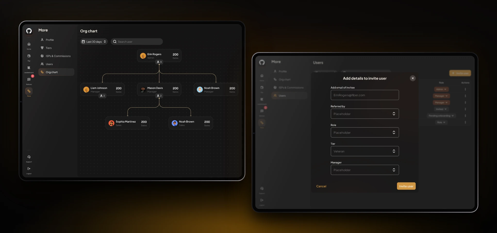
- The org chart draws admin, managers, and reps as connected cards with sales counts, a date filter, and user search. The Users list manages roles, tiers, and invitations, and the invite dialog captures email, referrer, role, tier, and manager.
- The problem
- Leaders needed downline visibility without exposure to private payouts, and the hierarchy needed protection from unauthorized sign-ups.
- Design decisions
- The hierarchy is a tree because who reports to whom is the information. Nodes show sales counts, never payouts, which keeps earnings private by construction. Sign-up is invitation-only with expiring tokens, and admins assign role, tier, and manager up front, so a new user lands in the right place from first login. The invite flow is a modal, so admins keep their place in the list.
Designing for the moments the field doesn't cooperate.
- The screen
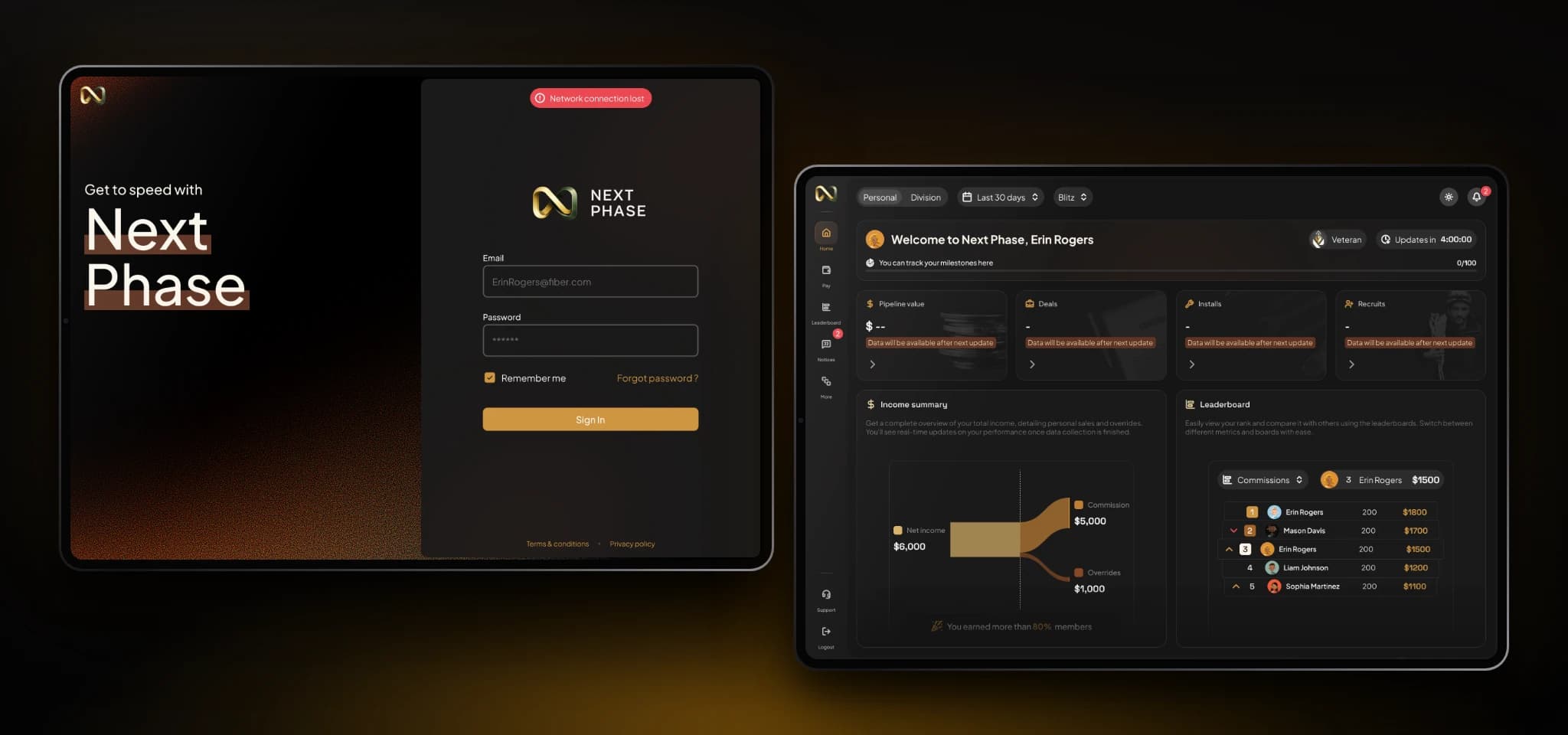
- The sign-in screen shows a red "Network connection lost" banner and keeps the form intact. The empty-state dashboard welcomes a new rep with placeholder values and short notes explaining that data arrives after the next update.
- The problem
- Field work means patchy connectivity, and new accounts start with no data. Blank screens or silent failures would read as bugs and erode trust in the numbers.
- Design decisions
- Connection loss uses a high-contrast red banner, distinct from the gold used for progress, so it is never mistaken for a celebration. Empty states keep the real layout with placeholders, so the screen previews what will appear and nothing shifts when data arrives. The copy says why data is missing and when it will show up, tying back to the nightly sync.
Edge cases & logic
Unrecognized ISP plan strings route to an admin holding queue, so operations can review them without blocking valid sales. Post-install cancellations appear as explicit clawback line items that adjust commissions while preserving tier history. A gauge shows how many accounts remain to retain regional override status, and expiring, token-only invites protect the team hierarchy from unauthorized sign-ups.
Reflection & next steps
Designing around field conditions (sunlight, fatigue, short interaction windows) mattered as much as any feature, and automation removed the largest source of commission friction. Next: multi-ISP commission rules for providers such as AT&T and Verizon, and predictive monthly earnings from current sales velocity. The result gave reps immediate earnings clarity, leaders trustworthy downline visibility, and operations an auditable source of truth.