Networking & discovery
ConnectIn
A mobile-first networking and hiring platform that pairs local discovery with fast, privacy-conscious applications.
Overview
ConnectIn is a mobile-first professional networking and hiring platform that combines local discovery, fast applications, and privacy-conscious matching. I led product design end to end across an 8-week 0-to-1 cycle for native iOS and Android: strategy, information architecture, interaction design, and the design system, for candidates, recruiters, and local professionals.
Impact
Job portals create application fatigue for candidates and screening noise for recruiters. ConnectIn makes applying faster while adding just enough qualification to improve match quality: a 65% reduction in candidate time-to-apply, a 40% increase in recruiter response rates through structured signals, and proximity that stays private through obfuscated location and mutual opt-in.
- Candidate time-to-apply
- 65% less
- Recruiter response rate
- +40%
The problem
Long mobile forms drive candidates away, and local opportunities are hard to find through remote-first networks. Recruiters receive high volumes of unqualified applications, and sharing exact location makes people hesitant to network locally.
Research & direction
Twelve candidate interviews and six talent-acquisition sessions, alongside patterns from LinkedIn, Bumble, and Google Maps, exposed a tension: candidates wanted the speed of swiping, while recruiters needed stronger intent signals. Local discovery called for fuzzy proximity rather than exact coordinates, and a completely frictionless apply flow risked low-quality applications. The pivot was "Swipe with Intent": express interest quickly, then confirm a small set of high-value criteria before applying.
Design decisions
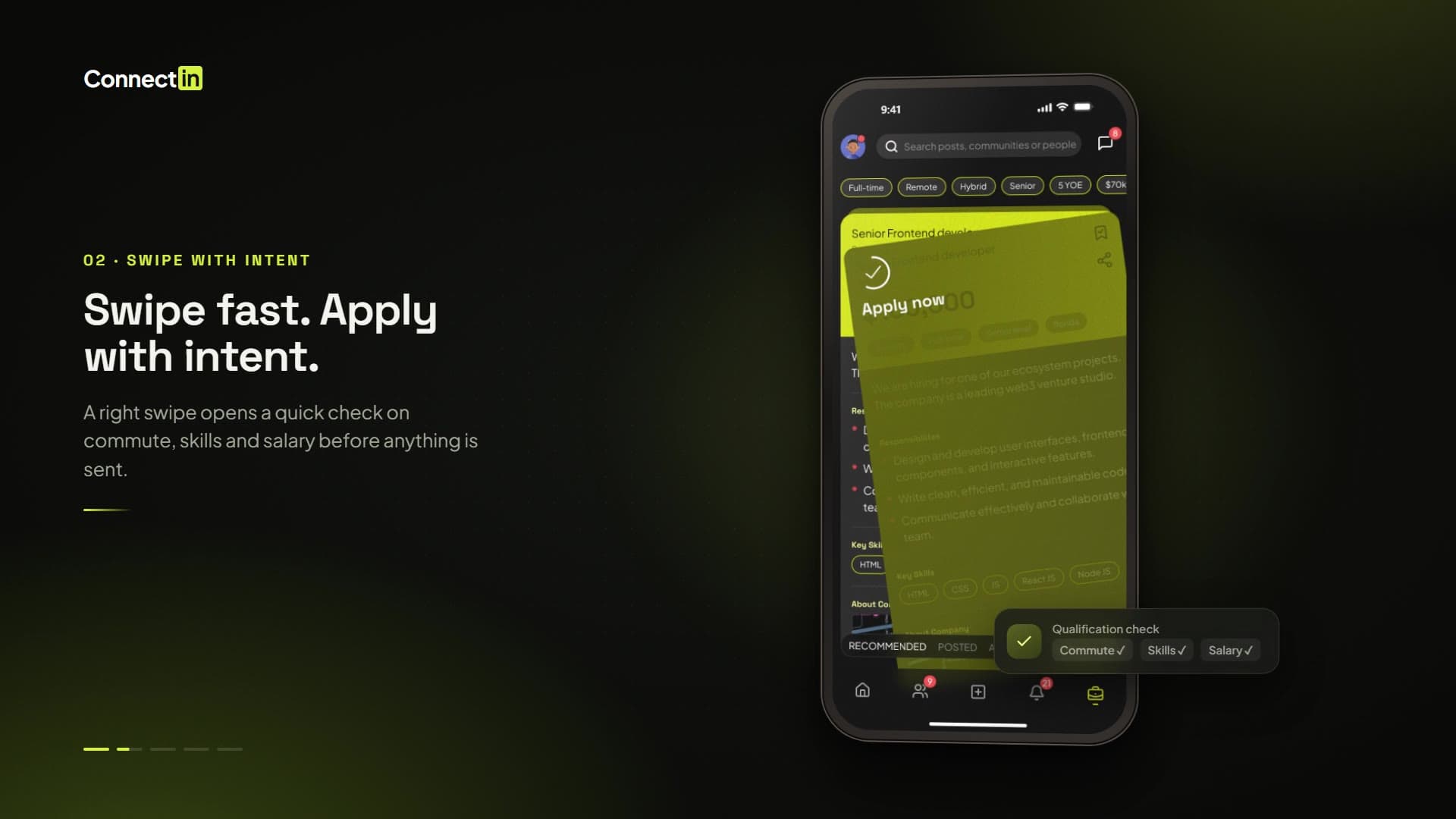
A right swipe opens a lightweight qualification check on commute willingness, skills, and salary expectations before the application is sent. That single step of friction is deliberate; it is what makes the recruiter's signal trustworthy. Privacy follows the same logic: fuzzy geo-bucketing shows approximate proximity, and detailed location and messaging unlock only after mutual interest. Profiles capture skills and preferences to drive recommendations, and a shared feed, universal search, and messaging connect the journeys.
Visual language
Space Grotesk headings pair with Plus Jakarta Sans body text on a high-contrast palette with dark and light surface modes. Material Design informed the familiar interaction patterns. Touch targets are at least 48dp, state changes are explicit, and primary controls sit in the bottom zone for one-handed use. Skill badges, commute radii, and structured match signals carry the information hierarchy.
Key screens
The walkthrough covers the core loops: applying to jobs, narrowing what you see, networking nearby, staying active in the feed, and turning a match into a conversation.
Job discovery reduced to a card, a gesture, and a decision.
- The screen
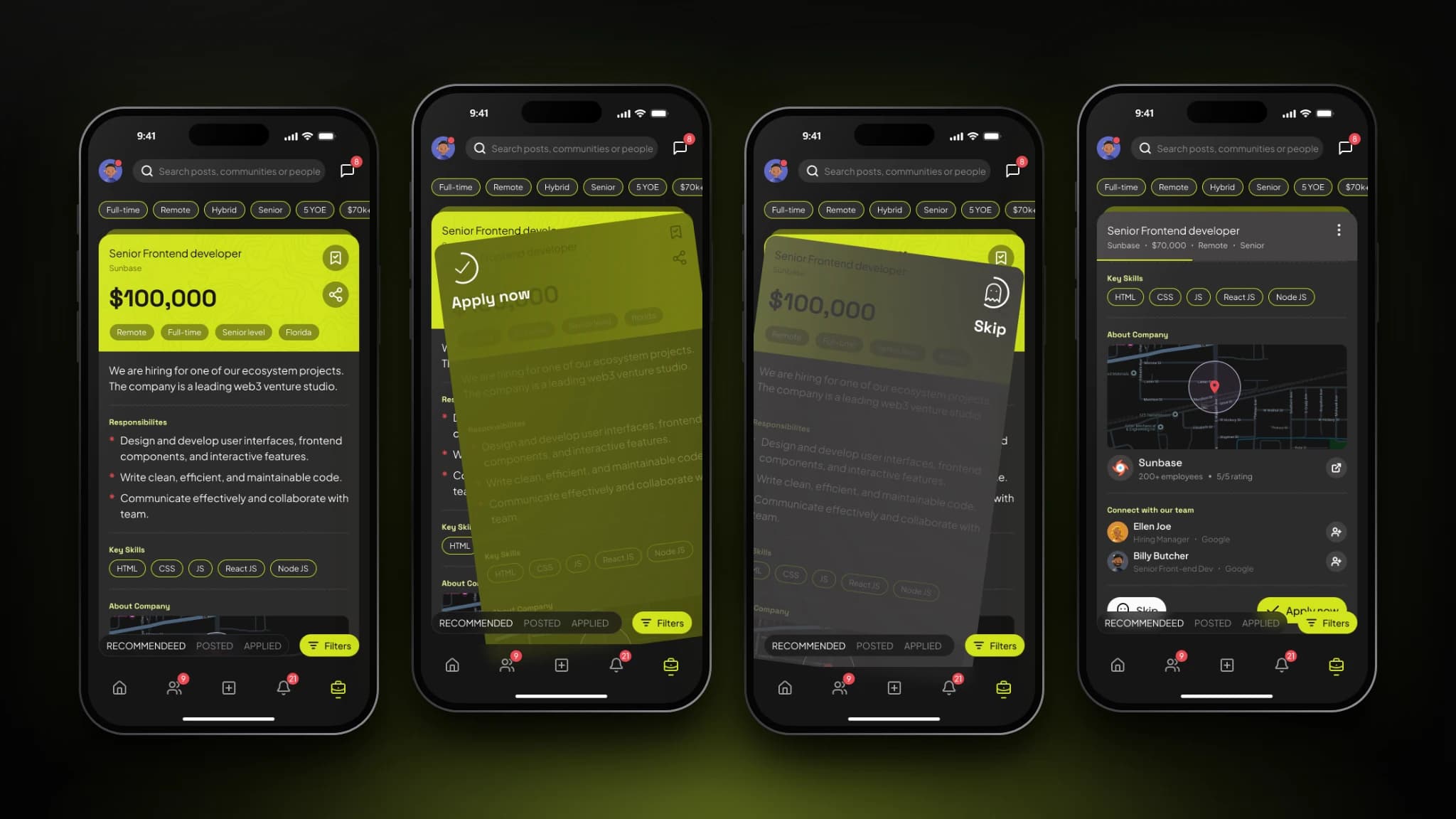
- The Jobs tab shows one role at a time as a card: title, company, salary, and work-mode tags on a lime header, with responsibilities and key skills below. Swiping right shows "Apply now" and swiping left shows "Skip". Scrolling collapses the header into a compact summary and reveals the company, a map of its location, and the hiring managers and team members to connect with.
- The problem
- Long application forms drive mobile drop-off, and candidates needed to judge a role quickly and know who to contact without leaving the flow.
- Design decisions
- The gesture borrows a pattern people already know from matchmaking apps, so applying is one motion instead of a form. Profile data fills the application, and a lightweight qualification check keeps recruiter signal trustworthy. The card leads with salary in large type because it is the first thing candidates weigh, and each swipe direction has its own overlay and label so the outcome is clear before the finger lifts. Recommended, Posted, Applied, and Filters stay in the bottom zone.
Narrowing a long list without leaving the flow.
- The screen
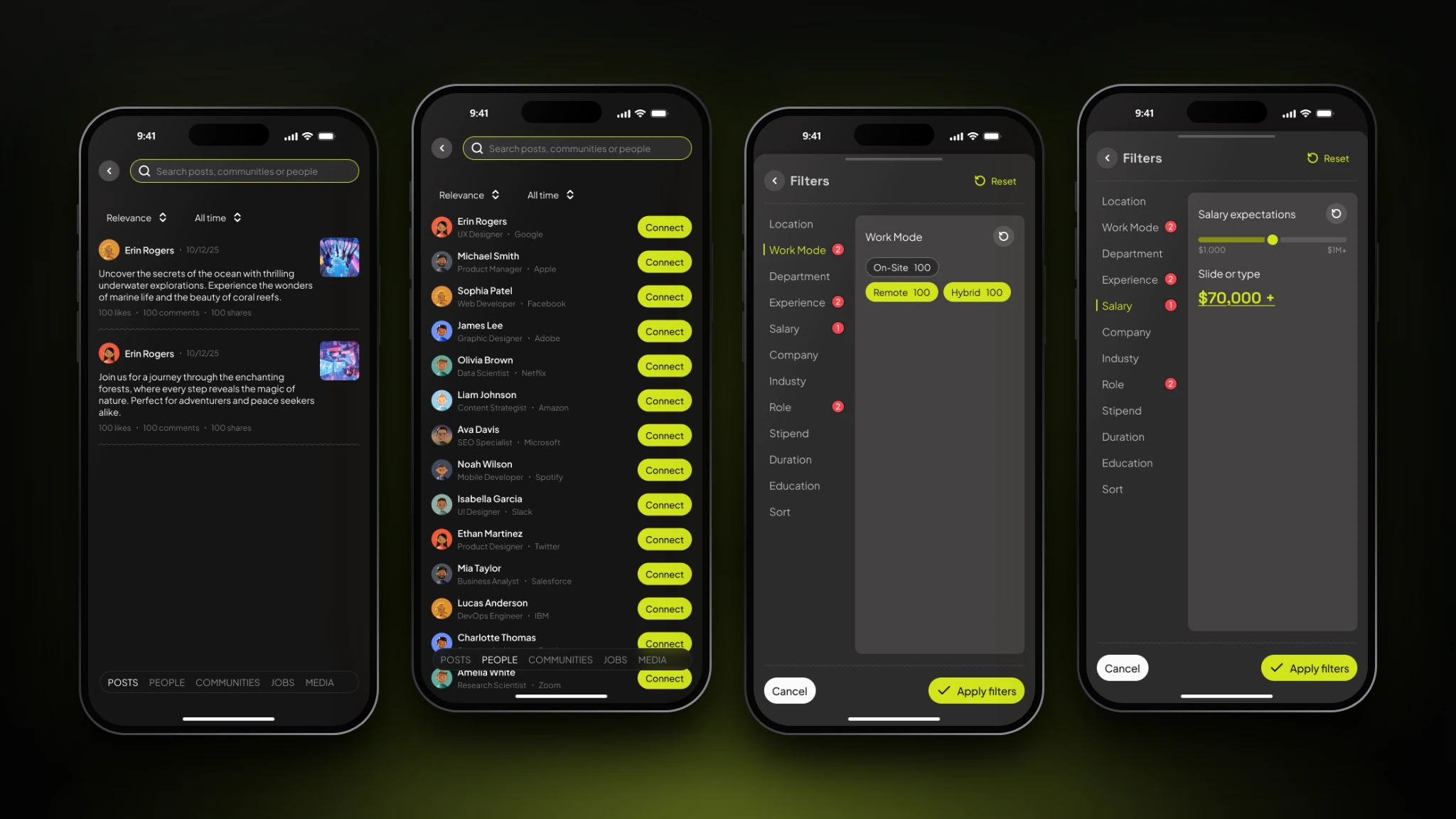
- Universal search covers posts, people, communities, jobs, and media from one field, with results in tabs and sorting by relevance and date. On Jobs, a filters bottom sheet groups location, work mode, department, experience, salary, and role, with badges for active filters and a salary slider that also accepts typed values.
- The problem
- Application fatigue comes from wading through poor matches. Users needed to reach relevant jobs, people, and content quickly.
- Design decisions
- Search is one entry point rather than one per section, and results are separated by type instead of mixed. Filters live in a full-height sheet with a category rail, so a long list of criteria stays scannable while Reset, Cancel, and Apply stay in view. Salary supports both slider and typed input, so people can be approximate or precise.
Networking through proximity, without exact locations.
- The screen
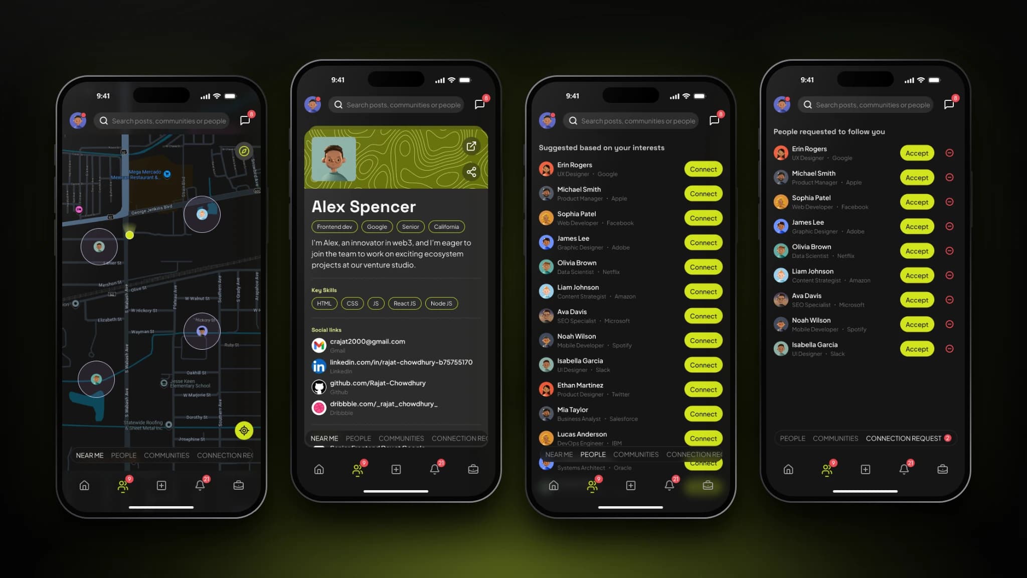
- The Connections tab opens on a map showing nearby professionals inside approximate-radius circles, not exact pins. Tapping a person opens a profile with skills, links, and a connect action. Further tabs suggest people and communities by shared interest and hold incoming requests with accept and decline.
- The problem
- Local opportunities are hard to find through remote-first networks, and people hesitate to network locally when exact location is shared.
- Design decisions
- Fuzzy geo-bucketing shows approximate proximity, and detailed location and messaging unlock only after mutual interest, so sharing feels safe. The map is the default because it makes "who is near me" legible at once. One tab row (Near me, People, Communities, Connection requests) keeps discovery and request management together, and each suggestion carries a single primary action so the next step is never ambiguous.
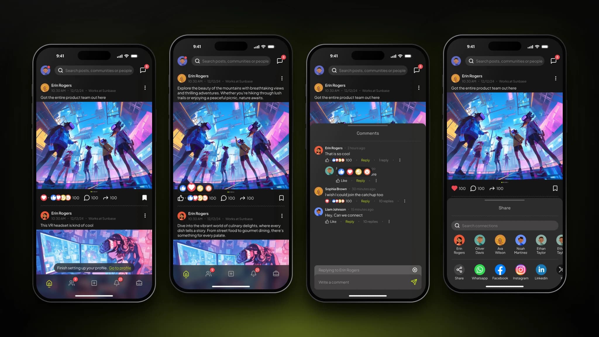
A familiar social layer that keeps the network active.
- The screen
- The home feed shows posts and media with reactions, comment and share counts, and a bookmark. Liking opens a reaction picker, comments open as a threaded sheet with a persistent reply bar, and the share sheet offers quick send-to-connection avatars, search, and external channels.
- The problem
- Finding a job and building a network usually happen on separate platforms. The feed gives ConnectIn a shared, everyday space that connects the two journeys.
- Design decisions
- The feed uses patterns people already know (reactions, threaded comments, sharing), so there is nothing new to learn. Comments and sharing open as bottom sheets over the post rather than new pages, keeping context visible. Bottom navigation puts Home, Connections, Create, Notifications, and Jobs within thumb reach, with a lime active state and red badges for what needs attention.
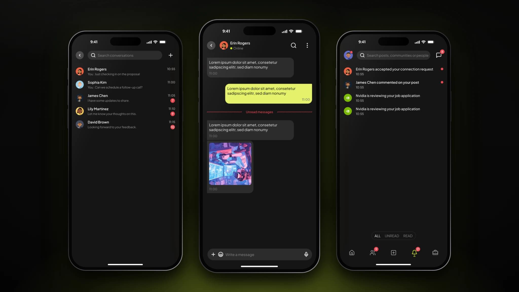
Turning a match into a conversation without leaving the app.
- The screen
- Conversations lists recent chats with previews, times, and unread counts. The chat view shows online status, sent messages in lime and received in grey, an "Unread messages" divider, image sharing, emoji, and voice input. Notifications filter by All, Unread, and Read across accepted requests, comments, and application updates.
- The problem
- A match only matters if it becomes a conversation, and important updates such as an accepted request or an application under review are easy to miss.
- Design decisions
- Messaging lives in the same product, so a new connection never has to move to another app. Color and alignment separate sent from received, and the unread divider marks where to resume. Notifications are organized around job lifecycle, network growth, and social engagement, with dots and count badges so priority reads at a glance.
Edge cases & logic
A cold-start marketplace widens the distance radius and says so clearly. Low-intent swiping is countered by qualification checks and structured profile signals, and daily intent tokens limit recruiter application overload. Location privacy rests on fuzzy geo-bucketing, explicit permissions, and dual opt-in unlocking.
Reflection & next steps
Marketplace UX sometimes needs purposeful friction. The qualification step costs candidates very little and gives recruiters something they can trust. Next: ATS integrations for Lever, Greenhouse, and Workday, plus explainable AI match scores and progressive privacy controls. ConnectIn reframes professional networking as fast, local, and privacy-conscious, balancing candidate momentum with recruiter confidence.